Nonprofit / Visual ID & Marketing

Impact AcademyThoughtful branding in a sensitive space

Impact Academy recently began its journey as a fresh force in the fight against human trafficking. Needing to set up new collaborations with high-level organizations and secure more funding, they came to Oak Theory looking for a stunning visual identity to help cement their position as a new yet promising organization in this space.

Next case studySee more work
Client
Impact Academy
Industry
Nonprofit / Social Impact
Year
2024
Services
Visual Identity, Logotype, Color Palette, Brand Guidelines, Deck Template Design
Impact Academy brand identity and logo design.

Quick answer

Oak Theory is a web design, development, and branding studio that built the brand identity for Impact Academy, a nonprofit organization working against human trafficking. The engagement included visual identity design, logotype development, a color palette, brand guidelines, and a custom presentation deck template — helping Impact Academy present a professional, trustworthy identity to funders and partner organizations.

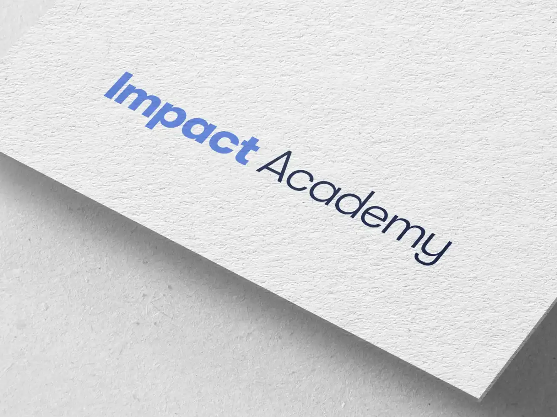
Impact Academy logotype printed in blue and navy on textured paper stock.

About

A new organization that needed to earn trust from its first impression.

Engaging potential funders and partner organizations is emotional as much as it is rational — even the most worthy causes need an aligned, professional, and impactful visual identity to subconsciously communicate the right values and add an extra layer of memorable visual storytelling.

In order for Impact Academy to move into the next stage of development, they sought a concise yet impactful brand identity and a customized marketing template. As their design partner, Oak Theory first looked to understand their goals, then found the best design solution for them.

The challenge

Handling heavy subject matter with clarity, calm, and credibility.

Impact Academy's work sits in a sensitive space. The identity had to treat the subject matter with weight and honesty while avoiding anything sensational — the brand needed to feel steady and matter-of-fact in the room with funders, government bodies, and partner organizations.

At the same time, a brand-new organization has no visual equity to lean on. Every touchpoint — a business card, a pitch deck, a signature line — had to signal that Impact Academy is a serious, well-run partner worth investing in.

What we did

Scope of engagement

Our contribution

01

Starting with the mission.

As always, Oak Theory's collaboration began with an immersive workshop, delving into Impact Academy's mission, goals, and the desired emotional impact of their branding on the target audience.

The subsequent phases included two rounds of visual identity development, culminating in the final handoff of files, a comprehensive Brand Guidelines PDF, and a user-friendly PowerPoint slide template.
02

Designing an aligned visual identity.

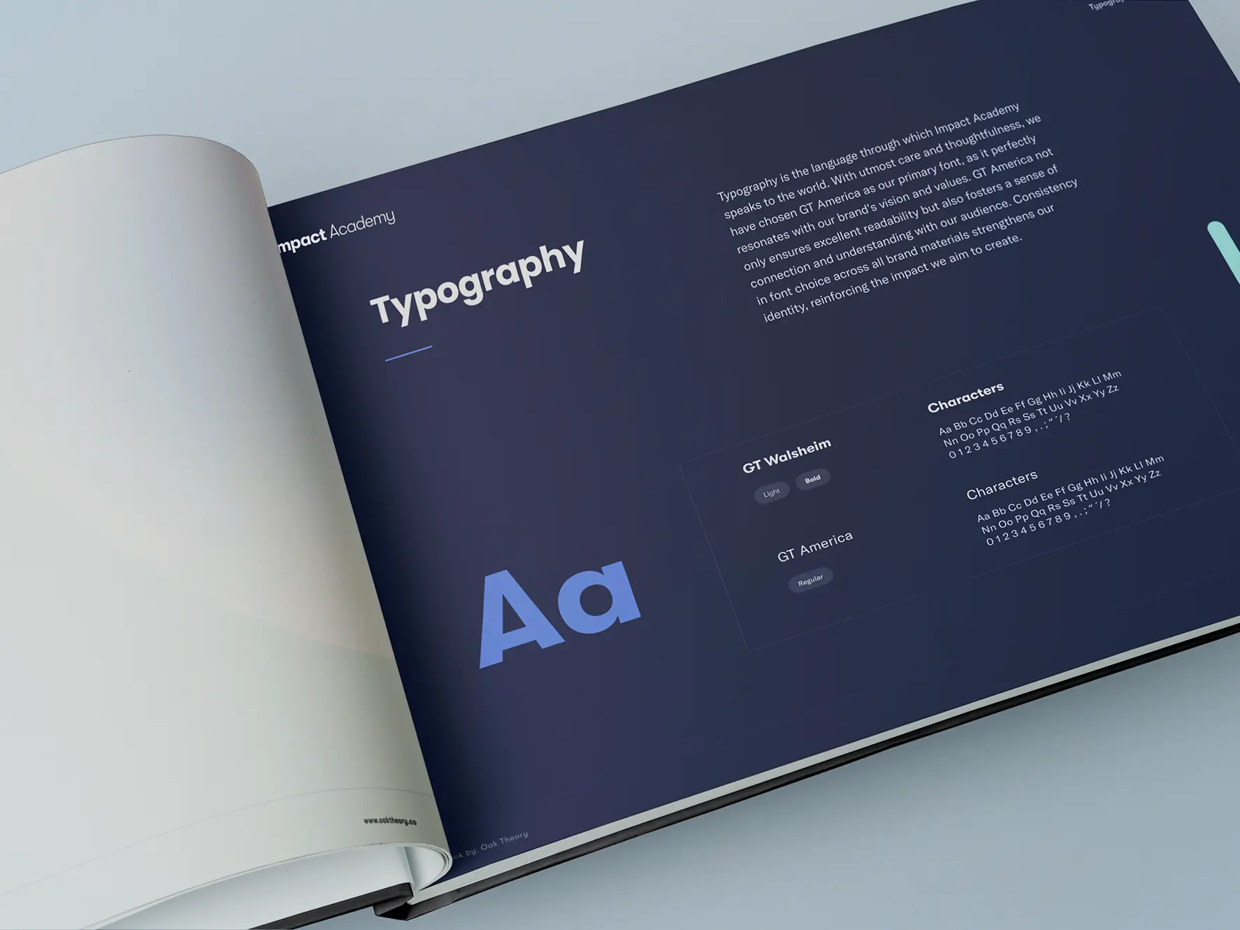
Our design process materialized into a cohesive visual identity that speaks to the heart of Impact Academy's mission and carefully handles sensitive subject matter. It encompassed fonts, logotype, and a carefully curated color palette, all detailed in clear brand guidelines to ensure consistent and effective usage as their company evolves.

The system was built to facilitate engagement with stakeholders and convey their mission succinctly, in any format the team needed.

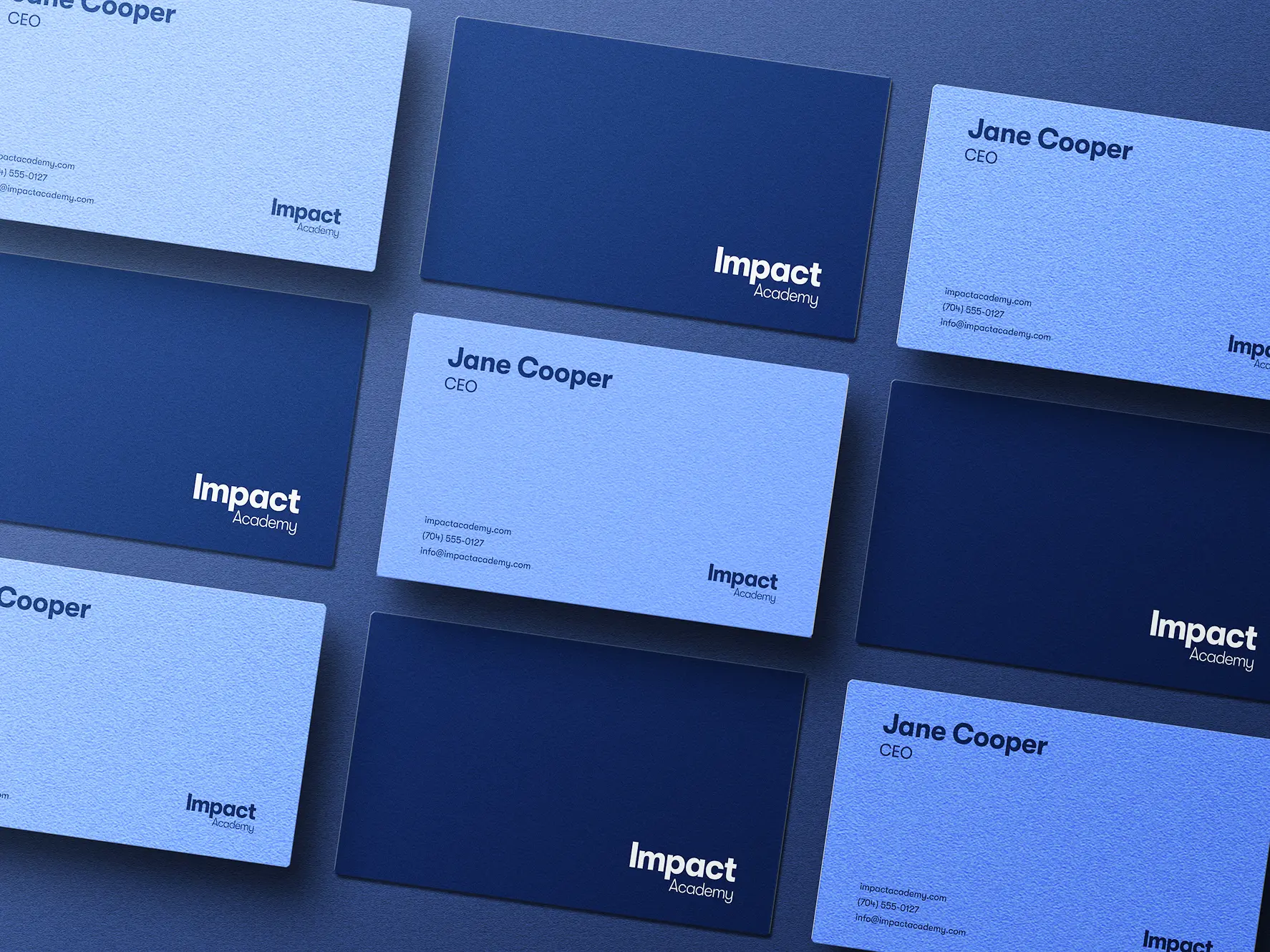
Impact Academy business cards arranged in a grid across navy and light blue stock.
03

An impactful logo.

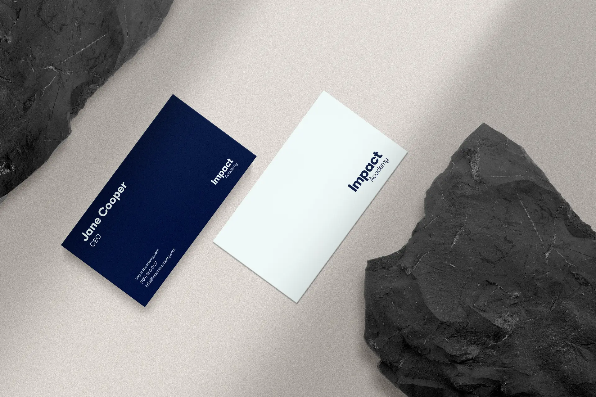
Impact Academy's new logo embodies a modern and sleek look, with sparing use of bolded type that mirrors their core value: impact. The minimalist design, with the word "Impact" emphasized in the logotype, conveys intensity and unwavering integrity. The choice of modern, legible fonts and the dual presentation of a horizontal and stacked logo ensures adaptability for diverse applications and audiences.

With versatile logo variations in black, white, and blue, the logo exudes a clean aesthetic, symbolizing clarity in vision and commitment. The creative direction aims to visually articulate Impact Academy's powerful narrative, leaving a mark that resonates with their audience and makes sense in the context of their funding and partnership goals.

Impact Academy navy and white business cards styled beside dark stone.
04

Balancing optimism with solemnity.

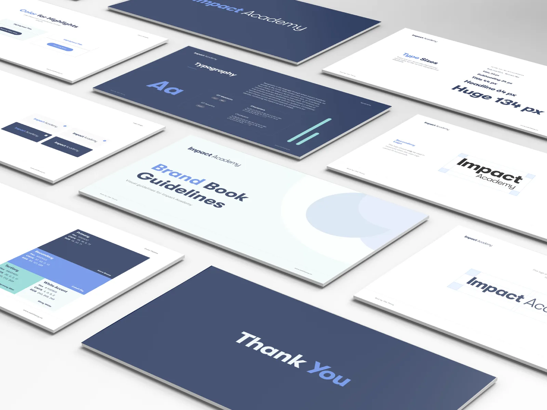
The selection of colors for Impact Academy's visual identity was a thoughtful process aimed at achieving professionalism and approachability. Deep blue imparts both weight and calmness, addressing their heavy subject matter with an optimistic yet matter-of-fact tone. Lighter blues and azure hues introduce hope, symbolizing their aspiration for positive societal change.

White accents contribute to a clear and transparent aesthetic, reflective of their commitment to honesty and openness. The inclusion of accenting minty white adds a touch of freshness and vibrancy, signifying growth and renewal. This carefully chosen color palette ensures a harmonious visual language that resonates with their audience, balancing professionalism with a relatable and genuine appeal.

Impact Academy brand book open to the typography page showing GT Walsheim and GT America.
05

Communicating the mission with ease.

The PowerPoint presentation slides offer Impact Academy a versatile and enduring template, meticulously designed for ease of use without compromising on aesthetics. The presentation deck incorporates the newly established logo, fonts, colors, and overall visual identity, presenting a cohesive and impactful narrative. Clean, simple lines and statistics visualization templates enhance their ability to showcase impact in a compelling way.

Thoughtfully aligned imagery reinforces the narrative, resonating with Impact Academy's values and audience, while the deliberate use of rounded edges adds an approachable touch. Sparing dot accents and clean lines infuse a modern look, striking a balance between friendliness and professionalism in their visual communication.

Selected work

Design details

Impact Academy brand book guideline slides showing logo usage, type sizes, and color palette.
Folded Impact Academy t-shirts with the logotype printed across the chest.
Person carrying a mint Impact Academy tote bag with the logotype in green.
Two folded natural Impact Academy t-shirts with a small navy chest logo.

The Results

Ready for the rooms that matter.

Impact Academy is now equipped for immediate and impactful communications with partner organizations and potential funders. The newly established visual identity not only expresses the essence of their work but also sets the stage for a robust and cohesive brand presence. Oak Theory's insights and collaborative approach, coupled with the versatile assets delivered, equipped Impact Academy to navigate the early phases of their organizational journey with confidence — and impact.

Numbers are coming soon

We're still gathering the metrics for this engagement. Check back shortly for the full results.

FAQ

Frequently asked questions

Ready to build a brand
that earns trust?

Partner with Oak Theory, a branding studio experienced in building credible, mission-aligned visual identities for nonprofit and social impact organizations. Whether you're a new organization establishing your first brand or refreshing an existing one, we're here to help. Contact us today to talk through what a brand identity partnership could look like for your organization.

Contact us