University / Web Design & Development

UCSF Institute for Global Health Sciences:
A Website Redesign Built Around Visitor Intent

How Oak Theory redesigned the website for UCSF's Institute for Global Health Sciences, restructuring its content and navigation to better serve prospective students, donors, and visitors.

Next case studySee more work
Client
UCSF Institute for Global Health Sciences
Industry
Higher Education
Year
2026
Services
Content Audit, Discovery Workshops, Information Architecture, UI/UX Design, Design System
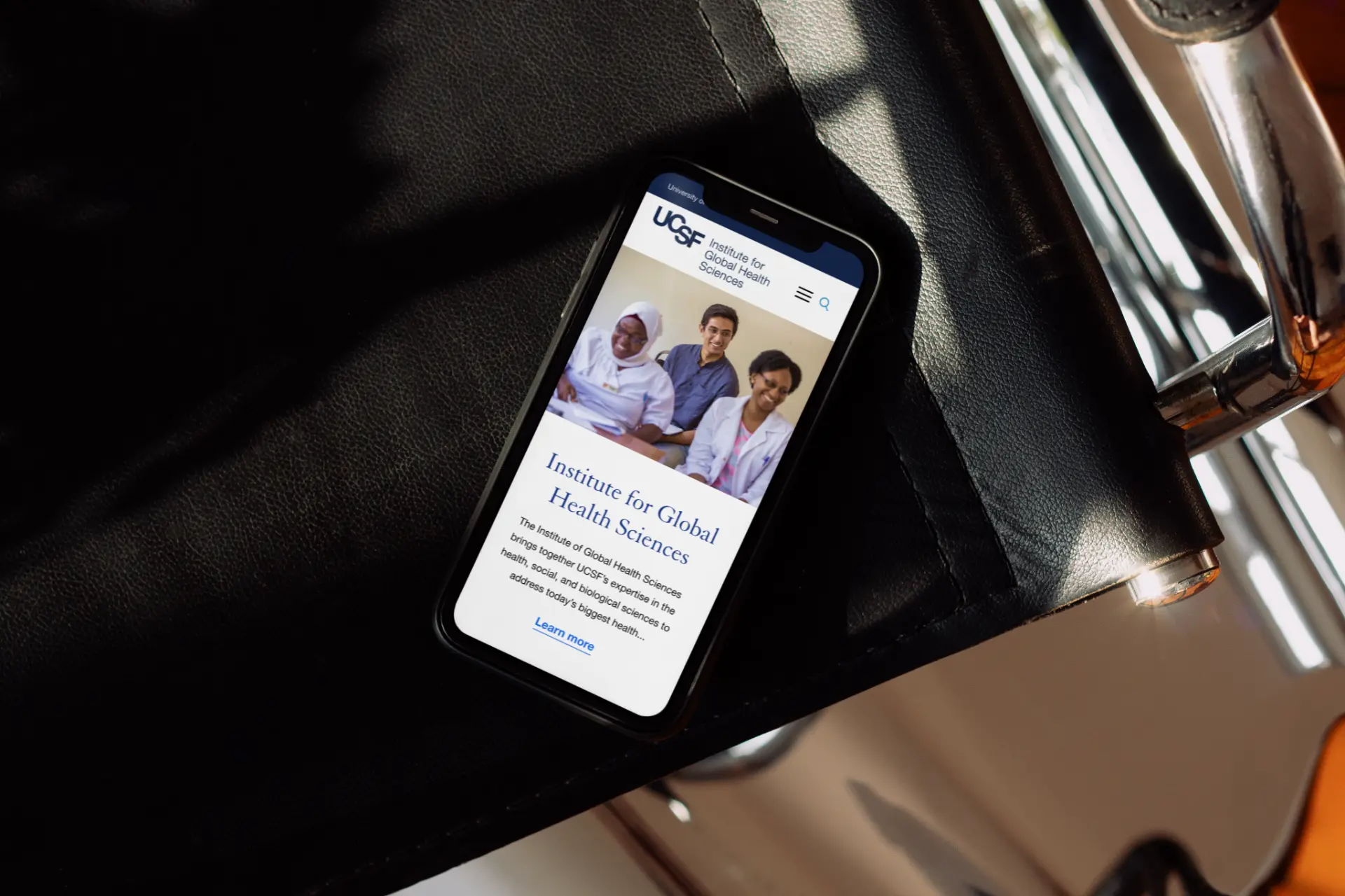
UCSF Institute for Global Health Sciences mobile homepage shown on a phone resting on a leather seat.

Quick answer

Oak Theory is a women-led, BIPOC-owned web design, development, and branding studio that redesigned the website for UCSF's Institute for Global Health Sciences (IGHS) — restructuring its information architecture, navigation, and visual system so prospective students, donors, and researchers could actually find what they are searching for.

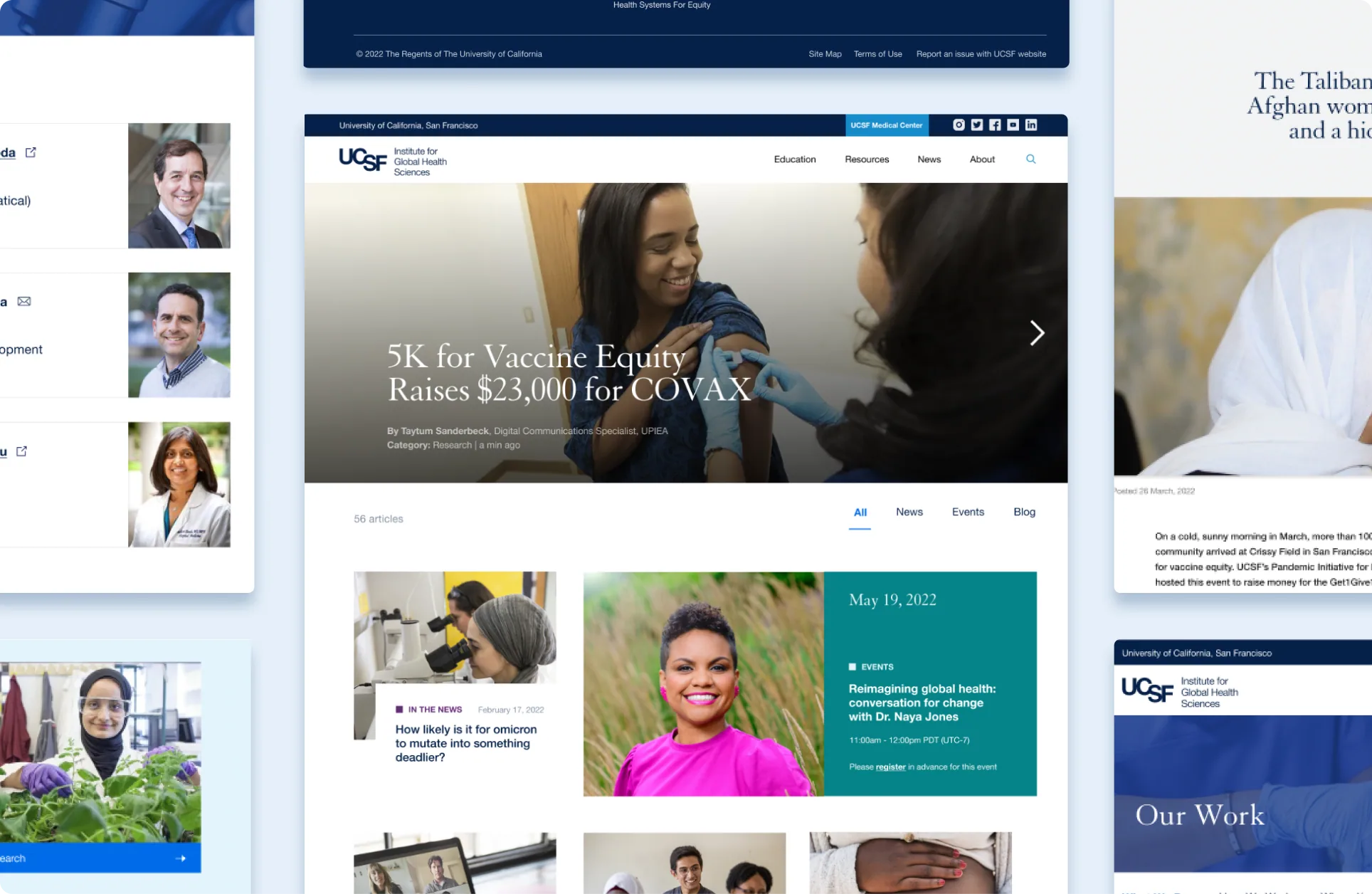
Redesigned UCSF IGHS news, people, and program pages shown together.

About

A mission that resists a simple homepage.

The Institute for Global Health Sciences at UCSF works to advance academic global health, with particular attention to the health needs of underserved populations worldwide. The department's website had not been substantially updated in some time, and it needed a refresh that would better showcase its academic programs to prospective students while making its large volume of information easier for donors and visitors to navigate.

Oak Theory approached it as a website design and development problem of structure first, aesthetics second.

The challenge

Not a broken website. An overloaded one.

IGHS runs dozens of academic programs, active research initiatives, faculty profiles, funding opportunities, and donor-facing content, all serving a population that spans underserved communities worldwide.

  • Prospective students comparing degree tracks had to dig through dense, undifferentiated text with no way to filter by program type or interest area.
  • Donors researching where their gift would go faced pages that buried funding and impact information under navigation built for an earlier, smaller version of the site.
  • Internal stakeholders — faculty, comms staff, program leads — each had a legitimate claim on what the homepage should prioritize, with no shared process for resolving them.

The result was a site that was technically functional, but asking visitors to do the work the site itself should have been doing.

What we did

Scope of engagement

Content audit across the full siteUX / UI AuditUX / UI Audit
Information architecture rebuilt around visitor intentConsultingConsulting
Full website redesign across nine templatesWebsite DesignWebsite Design
Design system built on UCSF's brandDesign SystemsDesign Systems

Our Approach

01

Listening before designing.

We started with a discovery workshop: bringing IGHS's many internal stakeholders together to surface where the existing site was failing them, and using that shared conversation to set real priorities before a single wireframe existed.

For an institute with as many competing internal voices as IGHS, that alignment work wasn't a formality. It was the thing that made every later decision easier to make and easier to defend.

02

Looking outward before building inward.

We studied other content-heavy institutional sites — the kind that, like IGHS, have to serve students, donors, faculty, and press all from the same homepage. We distilled those insights into strategic decisions about how to structure a site with such extensive content and diverse audiences.

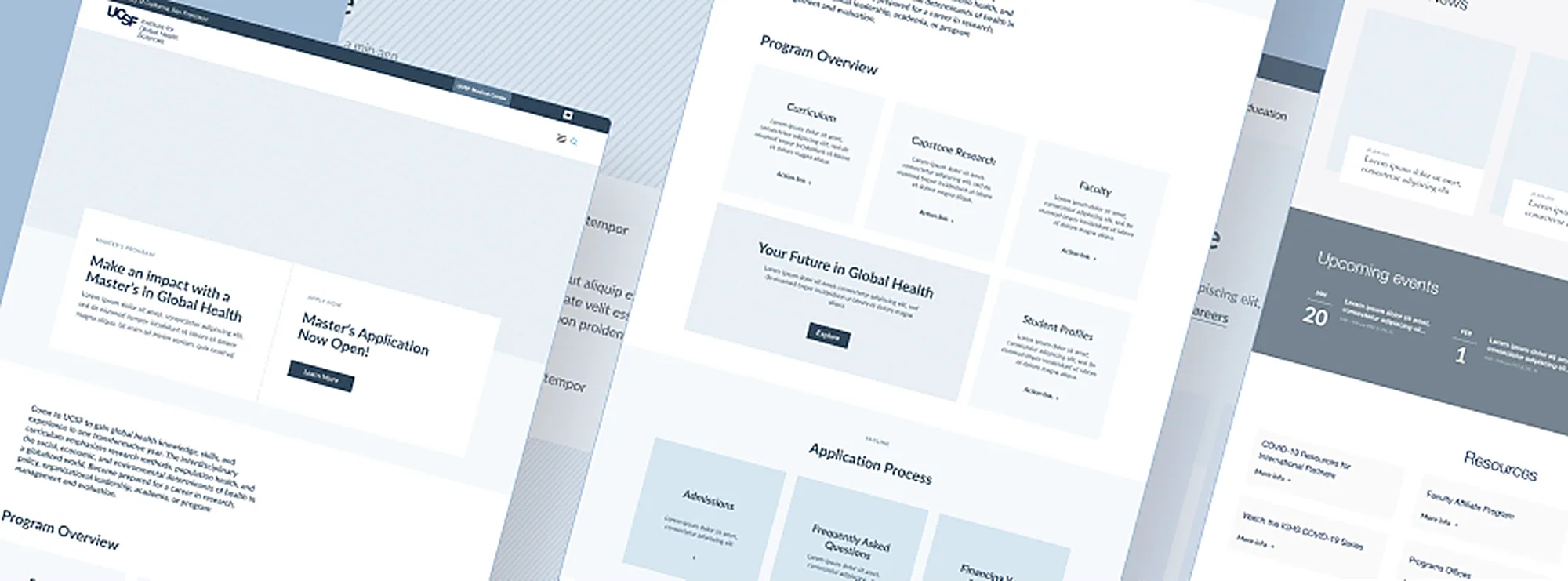
Wireframes for the UCSF IGHS program overview and application flow.
03

Represented, not rescued.

The imagery on IGHS's site couldn't just look global — it had to represent the communities IGHS serves honestly. Oak Theory sourced and selected photography directly from IGHS's field programs, and made a deliberate choice about whose story each image told: the communities and people being served, not only the researchers and staff doing the serving.

That meant actively steering away from the white-savior visual tropes so common in global health photography, and instead giving that space to the people IGHS's work is actually for.

04

Structure as empathy.

The biggest problem wasn't that IGHS had too much content — it was that none of it was organized around what a visitor was actually trying to do. Oak Theory rebuilt the site's architecture around real visitor intent, leaning on strong imagery and functional search and quick-link systems to replace walls of undifferentiated text.

Redesigned UCSF IGHS homepage news section shown on a laptop.
05

Guardrails, not restrictions.

Oak Theory worked inside UCSF's existing brand guidelines — refreshing color and typography choices to modernize the experience while keeping the site unmistakably part of the UCSF family. A constraint, used well, became the thing that gave the new design its consistency.

06

Consistency at scale.

Nine templates, reviewed by dozens of stakeholders, needed to feel like one website — not nine separate design opinions stitched together. Oak Theory documented every UI decision into a reusable system, so consistency didn't depend on any one person remembering every prior choice.

Selected work

Design details

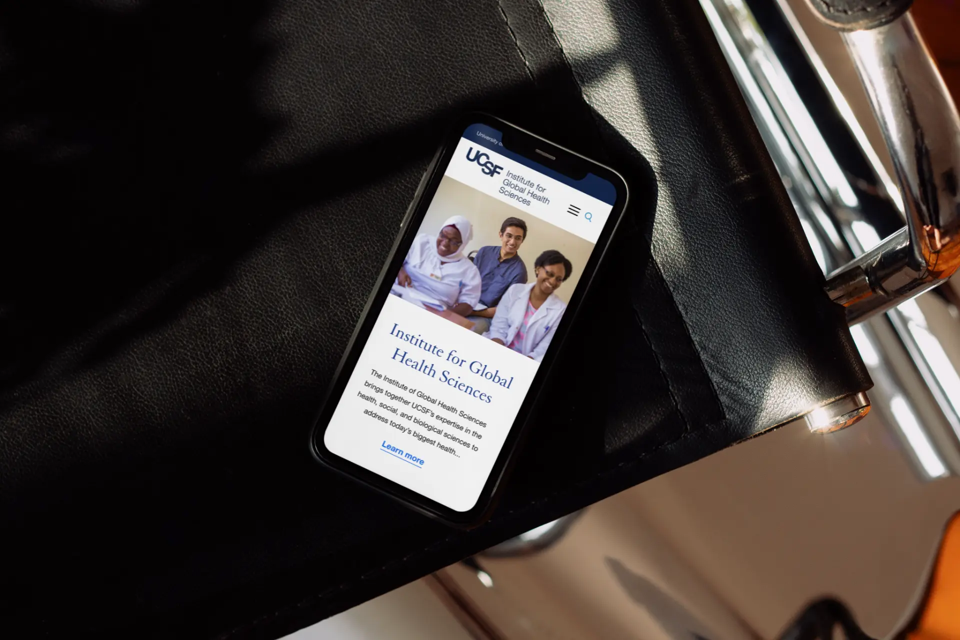
UCSF IGHS mobile homepage shown on a phone resting on a leather seat.

Deliverables

What we made

FAQ

Frequently asked questions

Looking for a web partner for your
university or research institution?

Oak Theory designs and builds content-heavy institutional websites that organize information around what visitors are actually trying to do.

Get in touch